Pavilion of Incremental Form
The studio for a graphic design artist is situated on a narrow parcel of land surrounded by high boundary walls and dense green. The pavilion is an annex to an existing residential and seamlessly integrates outside and inside, using the exterior boundary walls of the plot to generate an interiority for the project. The brief was to allow for maximum transparency and openness while building the project quickly and cheaply. Additionally the foundations and structure are designed such that in the future the building can grow vertically by an additional two storeys. Pavilion as Object:
The pavilion is thought of as a classical ‘object in space’ retaining its formal autonomy while establishing strong spatial connections to the dense green backyard. The pavilion is entirely transparent on all three sides with the only wall being toward the side of the existing house. A small toilet and pantry orient the building gently toward the main space of the garden.
Literal Transparency:
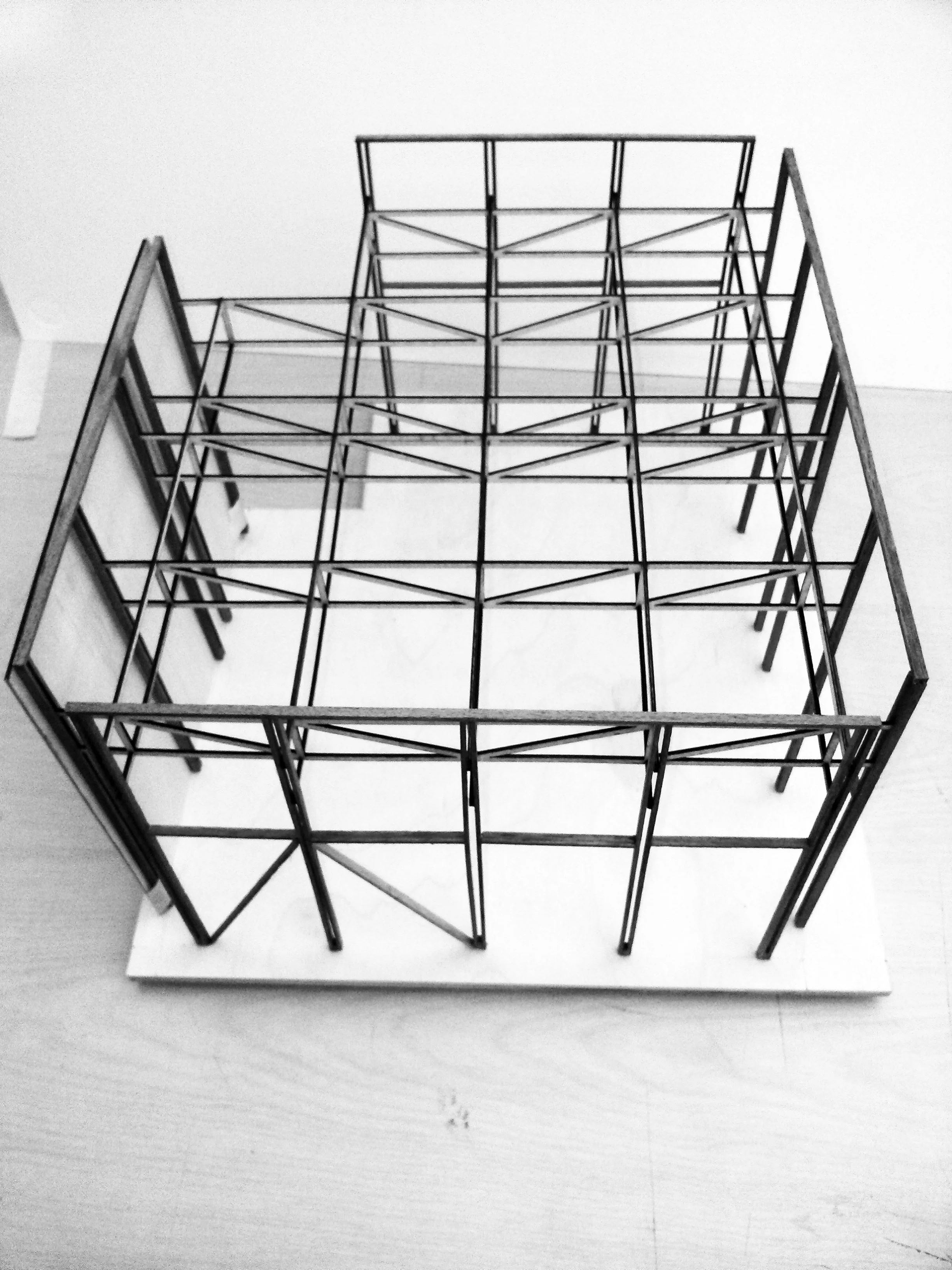
The pavilion is conceived as a slender steel exoskeleton with a rainscreen; on the inside of which a glass box is housed. This allows for a layered reading of space. The literal transparency of the glass expands the perception of the pavilion to the edge of the boundary walls of the site. The concrete plinth distinct on which the building sits, further acknowledges the distinction of the pavilion from its immediate site.
Large sliding glass doors and the painted steel columns establish an order for the project that is at once universal and distinct from the neighboring house. Two long rectilinear skylights run along the entire length of the studio. One of the skylights separates a brick wall from the steel structure while the other cuts across the studio perpendicularly articulating the space into two parts.
Structure & Construct:
The Steel ‘box’ exoskeleton consists of Mild Steel columns 66x33mm, - these are doubled up to reinforce an idea of slenderness. The roofing structure consists of a thin truss system made up of 50x50mm square MS sections. This truss system supports fifteen precast funicular concrete shells that generate the spanning system for the roof.
A handcrafted wooden rain screen will sit on the upper panels of the structure on three faces of the pavilion. In addition to being a secondary skin, it will also act as protection from glare and lashing rain. Combining hand craftsmanship with the industrial logic of a precast steel frame construction problematizes and questions the assumed coherence of these material orders, especially considering the reality of small contractor driven construction practices in India. In practice, contractors and steel fabricators, operating at the domestic scale, inevitably use the default practices of in-situ construction, where steel is still measured, cut, welded and finished on site. Hence as architects we do not consider these orders to be as distinct as they theoretically appear to be, and in fact celebrate the customizable and handmade quality of these systems.
Towards an Incremental Form:
The foundations of the pavilion provide for a three storeyed building - allowing the pavilion to grow accretively over time. This idea of incremental growth is central to the formal strategy of the project and allows an open-ended field of possibilities - a genealogy of future growth, carrying the embedded potential for evolution. Form is not thought of as static but one that is responsive to the future needs of program and economy. The detailing of the structure reflects this open-endedness. The steel columns connect to the horizontal slab (roof) only through lateral connections. In this sense the uninterrupted vertical columns are both a structural requirement as well as symbolic of the unfinished nature of the project.
with Riyaz Tayyibji, Anthill Design
Featured Online: Architizer, Phadion Atlas, Curbed Magazine, Indian Architect & Builder


